Introduction to CREsted with peak regression#
In this introductory notebook, we will train a peak regression model on mouse cortex data and inspect the results to get a feel for the capabilities of the CREsted package.
Importing data#
For this tutorial, we will use the mouse BICCN dataset which is available in the get_dataset() function.
To train a CREsted peak regression model on your data, you need:
A consensus regions BED file containing all the regions of interest across cell types.
A folder containing the bigwig files per cell type, or a list of bigwig files.
A genome fasta file and optionally a chromosome sizes file.
You could use a tool like SnapATAC2 or pycisTopic to generate the consensus regions and bigwig files from your own data.
import anndata as ad
import crested
import numpy as np
import matplotlib.pyplot as plt
import keras
By loading our genome in the crested.Genome class and setting it with register_genome(), the genome is automatically used in all functions throughout CREsted. If you don’t provide the chromomsome sizes, they will be automatically calculated from the fasta.
Note
Any function or class that expects a genome object can still accept a genome object as explicit input even if one was already registered. In that case, the input will be used instead of the registered genome.
## Set the genome
genome = crested.Genome("mm10/genome.fa", "mm10/genome.chrom.sizes")
crested.register_genome(genome)  # Register the genome so that it's automatically used in every function

print(genome.fetch("chr1", 10000000, 10000010))
2026-02-16T17:13:59.533588+0100 INFO Genome genome registered.
TTTTCAATGC
For this tutorial we will be training on the ‘cut sites’, but the ‘coverage’ data are also available (an older version of the tutorial would train on the coverage). Data is originally from Zemke et al., Nature, 2023.
Of course, if you have the data already available, you can specify the paths directly.
bigwigs_folder, regions_file = crested.get_dataset("mouse_cortex_bigwig_cut_sites")

# Alternatively, pass your paths manually
# You can also provide a list of paths or a dict of {class_name: path, ...} for bigwigs_folder
# bigwigs_folder = "crested/mouse_biccn/bigwigs_cut_sites.tar.gz.untar"
# regions_file = "crested/mouse_biccn/consensus_peaks_biccn.bed"
We can use the import_bigwigs() function to import bigwigs per cell type and a consensus regions BED file into an anndata.AnnData object,
with the imported cell types as the AnnData.obs and the consensus peak regions as the AnnData.var.
Hint
target determines how the values within a region are combined ('count', 'max', 'mean', …).
If your resulting values would be very low, like with the sparse data from cut sites bigwigs, we recommend using 'count' (summing within each window). Otherwise, we recommend using 'mean'.
adata = crested.import_bigwigs(
    bigwigs_folder=bigwigs_folder,
    regions_file=regions_file,
    target_region_width=1000,  # optionally, use a different width than the regions file (here, 500bp) for the .X values calculation
    target="count",  # or "max", "mean", "logcount" --> what we will be predicting
)
adata
2026-02-16T17:15:17.442422+0100 INFO Extracting values from 19 bigWig files...
AnnData object with n_obs × n_vars = 19 × 546993
    obs: 'file_path'
    var: 'chr', 'start', 'end', 'target_start', 'target_end'
To train a model, we always need to add a split column to our dataset, which we can do using crested.pp.train_val_test_split().
This will add a column to the AnnData.var with the split type for each region (train, val, or test).
# Choose the chromosomes for the validation and test sets
crested.pp.train_val_test_split(adata, strategy="chr", val_chroms=["chr8", "chr10"], test_chroms=["chr9", "chr18"])

# Alternatively, we can split randomly on the regions
# crested.pp.train_val_test_split(
#     adata, strategy="region", val_size=0.1, test_size=0.1, random_state=42
# )

print(adata.var["split"].value_counts())
adata.var.head(3)
2026-02-16T17:16:02.406066+0100 INFO Lazily importing module crested.pp. This could take a second...
split
train    440993
val       56064
test      49936
Name: count, dtype: int64
| chr | start | end | target_start | target_end | split | |
|---|---|---|---|---|---|---|
| region | ||||||
| chr1:3094805-3095305 | chr1 | 3094805 | 3095305 | 3094555 | 3095555 | train |
| chr1:3095470-3095970 | chr1 | 3095470 | 3095970 | 3095220 | 3096220 | train |
| chr1:3112174-3112674 | chr1 | 3112174 | 3112674 | 3111924 | 3112924 | train |
Preprocessing#
Region width#
For this example we’re interested in training on wider regions than our consensus regions file (500bp), so that we also include some sequence information from the tails of our peaks.
Here, we’ll change it to 2114 bp regions, since that is a known size that works well with the default crested.tl.zoo.dilated_cnn() model architecture we’ll use. This is not fixed and can be adapted to what you prefer, as long as it is compatible with the model architecture.
Wider regions will mean that you don’t only include sequence information from the center of the peaks and could effectively increase your dataset size if the tails of the peak include meaningful information, but could also introduce noise if the tails are not informative.
Wider regions will also increase the computational cost of training the model.
crested.pp.change_regions_width(adata, width=2114)
Peak normalization#
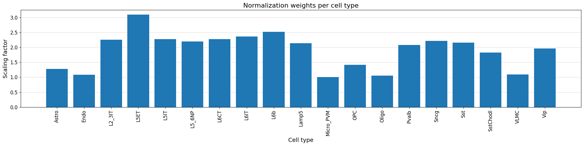
Additionally, we can normalize our peak values based on the variability of the top peak heights per cell type using crested.pp.normalize_peaks().
This function applies a normalization scaling factor to each cell type, obtained by comparing the distribution of peak heights for the maximally accessible, aspecific regions per cell type.
The top_k_percent parameter can be tuned based on potential bias towards cell types. If some weights are overcompensating too much, consider increasing the top_k_percent. The default is 0.01, but here we’ll use 0.03:
crested.pp.normalize_peaks(adata, top_k_percent=0.03)
2026-02-16T17:16:20.554363+0100 INFO Filtering on top k Gini scores...
2026-02-16T17:16:25.546554+0100 INFO Added normalization weights to adata.obsm['weights']...
| chr | start | end | target_start | target_end | split | |
|---|---|---|---|---|---|---|
| region | ||||||
| chr5:76656624-76658738 | chr5 | 76656624 | 76658738 | 76657181 | 76658181 | train |
| chr13:30900787-30902901 | chr13 | 30900787 | 30902901 | 30901344 | 30902344 | train |
| chr9:65586049-65588163 | chr9 | 65586049 | 65588163 | 65586606 | 65587606 | test |
| chr9:65586556-65588670 | chr9 | 65586556 | 65588670 | 65587113 | 65588113 | test |
| chr9:65587095-65589209 | chr9 | 65587095 | 65589209 | 65587652 | 65588652 | test |
| ... | ... | ... | ... | ... | ... | ... |
| chr9:65459289-65461403 | chr9 | 65459289 | 65461403 | 65459846 | 65460846 | test |
| chr9:65459852-65461966 | chr9 | 65459852 | 65461966 | 65460409 | 65461409 | test |
| chr5:76587680-76589794 | chr5 | 76587680 | 76589794 | 76588237 | 76589237 | train |
| chr9:65523082-65525196 | chr9 | 65523082 | 65525196 | 65523639 | 65524639 | test |
| chr19:18337654-18339768 | chr19 | 18337654 | 18339768 | 18338211 | 18339211 | train |
48308 rows × 6 columns
We can visualize the normalization factor for each cell type using the crested.pl.qc.normalization_weights() function to inspect which cell type peaks were up/down weighted.
%matplotlib inline
crested.pl.qc.normalization_weights(adata, title="Normalization weights per cell type", xtick_rotation=90)
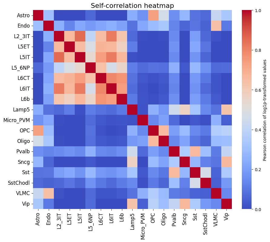
To get a feeling for our data, we can also look at the self-correlation between classes. If there are certain classes that very strongly anti-correlate with everything else, this can be a sign of low-quality data or strong outliers that might hinder training.
%matplotlib inline
crested.pl.corr.heatmap_self(adata, log_transform=True, vmin=0, vmax=1, reorder=True)
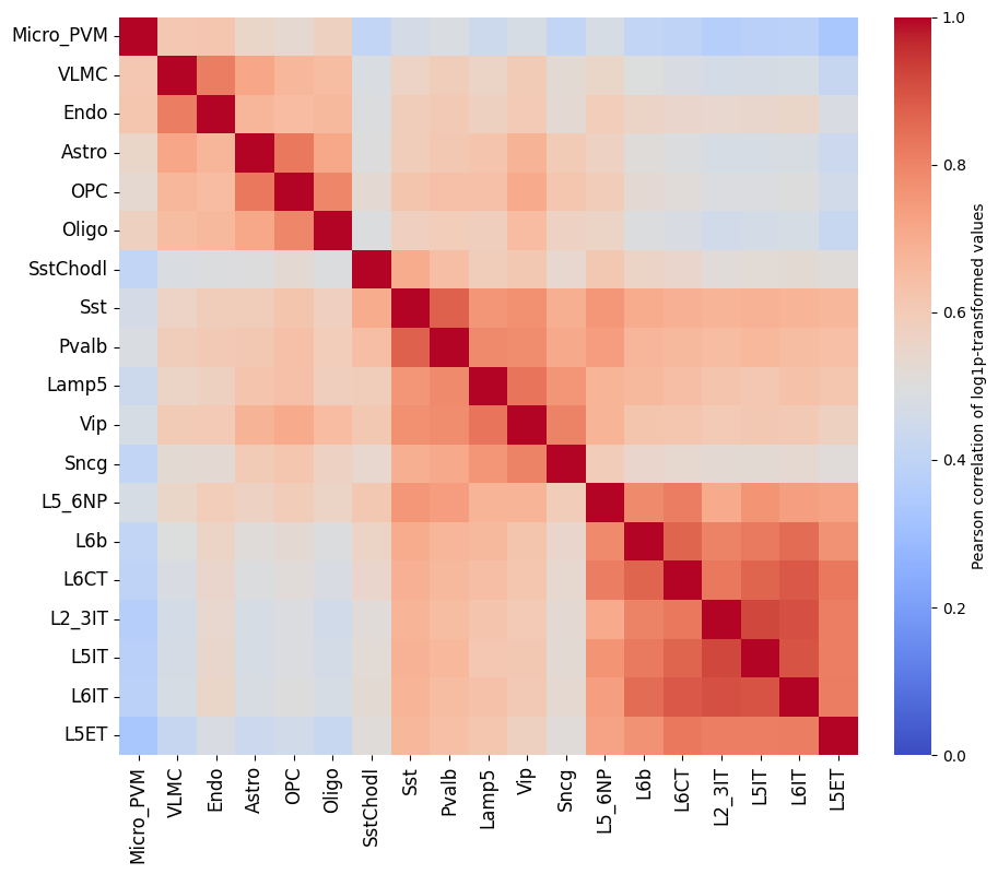
This dataset looks ready to go: there’s no crazy outlier classes, and robust differences between the different classes. We do see higher correlations between the profiles of different excitatory neurons, but this is expected biologically.
# Save the final preprocessing results
adata.write_h5ad("crested/mouse_cortex.h5ad")
There is no single best way to preprocess your data, so we recommend experimenting with different preprocessing steps to see what works best for your data.
Likewise there is no single best training approach, so we recommend experimenting with different training strategies.
Model training#
The CREsted training workflow is built around the crested.tl.Crested() class.
This class has a couple of required arguments:
data: thecrested.tl.data.AnnDataModuleobject containing all the data (anndata, genome) and dataloaders that specify how to load the data.model: thekeras.Modelobject containing the model architecture.config: thecrested.tl.TaskConfigobject containing the optimizer, loss function, and metrics to use in training.
Since training can take a long time, it’s often better to run these steps in a script or a python file, so you could run it on a cluster or in the background.
Data#
We’ll start by initializing the crested.tl.data.AnnDataModule object with our data.
This will tell our model how to load the data and what data to load during fitting/evaluation.
The main arguments to supply are the adata object, the genome object (if you didn’t register one), and the batch_size.
Other optional arguments are related to the training data loading (e.g. shuffling, whether to load the sequences into memory, …).
datamodule = crested.tl.data.AnnDataModule(
    adata,
    batch_size=128,  # lower this if you encounter OOM errors
    max_stochastic_shift=3,  # optional data augmentation to slightly reduce overfitting
    always_reverse_complement=True,  # default True. Will double the effective size of the training dataset.
)
Model definition#
Next, we’ll define the model architecture. This is a standard Keras model definition, so you can provide your own model definition if you like.
Alternatively, there are a couple of ready-to-use models available in the crested.tl.zoo module.
Each of them require the width of the input sequences and the number of output classes (your adata.obs) as arguments.
# Load a dilated cnn architecture for a dataset with 2114bp regions and 19 cell types
model = crested.tl.zoo.dilated_cnn(seq_len=2114, num_classes=adata.n_obs)
TaskConfig#
The TaskConfig object specifies the optimizer, loss function, and metrics to use in training (we call this our ‘task’).
Some default configurations are available for some common tasks such as ‘topic_classification’ and ‘peak_regression’,
which you can load using the crested.tl.default_configs() function.
Hint
If using mean values with crested.tl.losses.CosineMSELogLoss(), we recommend setting the multiplier to the number of basepairs you’re averaging over (your target_region_width), which here is 1000. Default config 'peak_regression_mean' automatically uses multiplier=1000 for this reason.
Alternatively, you can create your own TaskConfig object and specify the optimizer, loss function, and metrics yourself if you want to do something completely custom.
Here, we replicate the values from crested.tl.default_configs("peak_regression_count") manually:
# Load the default configuration for training a peak regression model on cutsites
config = crested.tl.default_configs("peak_regression_count")  # or "peak_regression_mean"/"topic_classification"

# Or create your own:
# optimizer = keras.optimizers.Adam(learning_rate=1e-3)
# loss = crested.tl.losses.CosineMSELogLoss(max_weight=100, multiplier=1)
# metrics = [
#     keras.metrics.MeanAbsoluteError(),
#     keras.metrics.MeanSquaredError(),
#     keras.metrics.CosineSimilarity(axis=1),
#     crested.tl.metrics.PearsonCorrelation(),
#     crested.tl.metrics.ConcordanceCorrelationCoefficient(),
#     crested.tl.metrics.PearsonCorrelationLog(),
# ]
# config = crested.tl.TaskConfig(optimizer, loss, metrics)

print(config)
TaskConfig(optimizer=<keras.src.optimizers.adam.Adam object at 0x146fa6a71910>, loss=CosineMSELogLoss: {'name': 'CosineMSELogLoss', 'reduction': 'sum_over_batch_size', 'max_weight': 100}, metrics=[<MeanAbsoluteError name=mean_absolute_error>, <MeanSquaredError name=mean_squared_error>, <CosineSimilarity name=cosine_similarity>, <PearsonCorrelation name=pearson_correlation>, <ConcordanceCorrelationCoefficient name=concordance_correlation_coefficient>, <PearsonCorrelationLog name=pearson_correlation_log>])
Training#
Now we’re ready to train our model.
We’ll create a Crested object with the data, model, and config objects we just created.
Then, we can call the fit() method to train the model.
Read the documentation for more information on all available arguments to customize your training (e.g. augmentations, early stopping, checkpointing, …).
By default:
The model will continue training until the validation loss stops decreasing for 10 epochs with a maximum of 100 epochs.
Every best model is saved based on the validation loss.
The learning rate reduces by a factor of 0.25 if the validation loss stops decreasing for 5 epochs.
Note
If you specify the same project_name and run_name as a previous run, then CREsted will assume that you want to continue training and will load the last available model checkpoint from the {project_name}/{run_name} folder and continue from that epoch.
# setup the trainer
trainer = crested.tl.Crested(
    data=datamodule,
    model=model,
    config=config,
    project_name="mouse_biccn",  # change to your liking
    run_name="base_model",  # change to your liking
    logger="wandb",  # or None, 'dvc', 'tensorboard'
    seed=7,  # For reproducibility
)
# train the model
trainer.fit(
    epochs=60,
    learning_rate_reduce_patience=3,
    early_stopping_patience=6,
)
Finetuning on cell type-specific regions#
Subset the region set#
For peak regression models, we recommend to continue training the model trained on all consensus peaks on a subset of cell type-specific regions. Since we are interested in understanding the enhancer code uniquely identifying the cell types in the dataset, finetuning on specific regions will allow us to approach that. We define specific regions as regions with a high Gini index, indicating that their peak distribution over all cell types will be skewed and specific for one or more cell types.
Read the documentation of the crested.pp.filter_regions_on_specificity() function for more information on how the filtering is done. We can check the impact of different cutoffs with crested.pl.qc.filter_cutoff():
%matplotlib inline
crested.pl.qc.filter_cutoff(adata, cutoffs=[1.5, 1, 0.5], width=8, height=6)
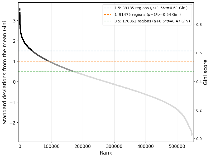
The default gini_std_threshold of 1 seems to result in an acceptable set that’s both specific and large enough to train on.
# All regions with a Gini index 1 std above the mean across all regions will be kept
adata_specific = crested.pp.filter_regions_on_specificity(adata, gini_std_threshold=1.0, inplace=False)
adata_specific
2026-02-15T10:31:17.660045+0100 INFO After specificity filtering, kept 91475 out of 546993 regions.
AnnData object with n_obs × n_vars = 19 × 91475
    obs: 'file_path'
    var: 'chr', 'start', 'end', 'target_start', 'target_end', 'split'
    obsm: 'weights'
adata_specific.write_h5ad("crested/mouse_cortex_filtered.h5ad")
Load the pre-trained model and finetune with a lower learning rate#
datamodule = crested.tl.data.AnnDataModule(
    adata_specific,
    batch_size=64,  # Recommended to go for a smaller batch size than in the base model
    max_stochastic_shift=3,
    always_reverse_complement=True,
)
# First load the pre-trained model
# Choose the base model with best validation loss/performance metrics
model = keras.models.load_model(
    "mouse_biccn/base_model/checkpoints/22.keras",
    compile=False,
)
We use the same config we used for the pretrained model, except for a lower learning rate. Make sure that is lower than it was on the epoch you select the model from.
old_config = crested.tl.default_configs("peak_regression_count")
new_optimizer = keras.optimizers.Adam(learning_rate=1e-4)  # Lower LR!
config = crested.tl.TaskConfig(new_optimizer, old_config.loss, old_config.metrics)
print(config)
TaskConfig(optimizer=<keras.src.optimizers.adam.Adam object at 0x14f25098de50>, loss=CosineMSELogLoss: {'name': 'CosineMSELogLoss', 'reduction': 'sum_over_batch_size', 'max_weight': 100}, metrics=[<MeanAbsoluteError name=mean_absolute_error>, <MeanSquaredError name=mean_squared_error>, <CosineSimilarity name=cosine_similarity>, <PearsonCorrelation name=pearson_correlation>, <ConcordanceCorrelationCoefficient name=concordance_correlation_coefficient>, <PearsonCorrelationLog name=pearson_correlation_log>])
# setup the trainer
trainer = crested.tl.Crested(
    data=datamodule,
    model=model,
    config=config,
    project_name="mouse_biccn",  # change to your liking
    run_name="finetuned_model",  # change to your liking
    logger="wandb",  # or 'wandb', 'tensorboard'
)
trainer.fit(
    epochs=60,
    learning_rate_reduce_patience=3,
    early_stopping_patience=6,
)
Evaluate the model#
Now we have a trained model, we can use the crested.tl toolkit to run inference and explain our results. All the functionality shown below only expects a trained .keras model, meaning that you can use these functions with any model trained outside of the CREsted framework too.
First, we need to load a model. If you followed the tutorial, you can load that one.
If not, CREsted has a ‘model repository’ with commonly used models which you can download with
get_model(). You can find all example models here.
# Reload your data if it's not the same session
adata = ad.read_h5ad("crested/mouse_cortex.h5ad")
adata_specific = ad.read_h5ad("crested/mouse_cortex_filtered.h5ad")
# Load your trained model, at its best (validation) epoch
model_path_base = "mouse_biccn/base_model/checkpoints/22.keras"
model_path_ft = "mouse_biccn/finetuned_model/checkpoints/02.keras"

model_base = keras.models.load_model(model_path_base, compile=False)
model = keras.models.load_model(model_path_ft, compile=False)
Predict#
predict() is CREsted’s swiss army knife: it lets you use the model to predict inputs in any form.
Since CREsted is build around making predictions over genomic sequences, this can accept as input:
(lists of) sequence(s)
(lists of) genomic region name(s)
one hot encoded sequences of shape (N, L, 4)
AnnData objects with regions as its .var index
CREsted will convert these inputs to its required format for the model.
If your input is a region name or AnnData, you should provide a genome as well if you did not register one.
You can even provide a list of models, as long as they expect the same input and output shapes. In that case the predictions will be averaged, which can be useful to make your predictions more robust.
Note
Due to issues in keras’s prediction functionality, running this for the entire AnnData can use a large amount of memory. If this is a bottleneck, we recommend running this once or in chunks, saving the AnnData with the prediction layers, and restarting the analysis from there.
Almost all plotting functions recognise predictions saved in the adata.layers slot, so we’ll be predicting all specific regions and saving the resulting predictions:
predictions_base = crested.tl.predict(adata_specific, model_base)
adata_specific.layers["Base model"] = predictions_base.T  # adata expects (classes, genes) instead of (genes, classes)
predictions_ft = crested.tl.predict(adata_specific, model)
adata_specific.layers["Finetuned model"] = predictions_ft.T
2026-02-16T13:09:03.967768+0100 INFO Lazily importing module crested.tl. This could take a second...
  5/715 ━━━━━━━━━━━━━━━━━━━━ 19s 27ms/step
713/715 ━━━━━━━━━━━━━━━━━━━━ 0s 27ms/step
715/715 ━━━━━━━━━━━━━━━━━━━━ 31s 32ms/step
715/715 ━━━━━━━━━━━━━━━━━━━━ 21s 28ms/step
Many of the plotting functions in the crested.pl module can be used to visualize these model predictions.
Evaluating on the test set#
Let’s first look at the performance on the test set using the evaluate() function:
crested.tl.evaluate(
    adata_specific,
    model='Finetuned model',
    metrics=crested.tl.default_configs('peak_regression_count')
)
2026-02-16T13:11:06.247458+0100 INFO Test CosineMSELogLoss: -0.6362
2026-02-16T13:11:06.248170+0100 INFO Test mean_absolute_error: 1.6739
2026-02-16T13:11:06.248430+0100 INFO Test mean_squared_error: 14.3069
2026-02-16T13:11:06.248631+0100 INFO Test cosine_similarity: 0.8715
2026-02-16T13:11:06.248820+0100 INFO Test pearson_correlation: 0.7809
2026-02-16T13:11:06.249006+0100 INFO Test concordance_correlation_coefficient: 0.7308
2026-02-16T13:11:06.249197+0100 INFO Test pearson_correlation_log: 0.6371
If you experimented with many different hyperparameters for your model, chances are that you will start overfitting on your validation dataset.
It’s therefore always a good idea to evaluate your model on the test set after getting good results on your validation data to see how well it generalizes to unseen data.
Example predictions on test set regions#
It is always interesting to see how the model performs on unseen test set regions. It is recommended to always look at a few examples to spot potential biases, or trends that you do not expect.
# Define a dataframe with test set regions
test_df = adata_specific.var[adata_specific.var["split"] == "test"]
test_df
| chr | start | end | target_start | target_end | split | |
|---|---|---|---|---|---|---|
| region | ||||||
| chr18:3269690-3271804 | chr18 | 3269690 | 3271804 | 3270247 | 3271247 | test |
| chr18:3350307-3352421 | chr18 | 3350307 | 3352421 | 3350864 | 3351864 | test |
| chr18:3451398-3453512 | chr18 | 3451398 | 3453512 | 3451955 | 3452955 | test |
| chr18:3463977-3466091 | chr18 | 3463977 | 3466091 | 3464534 | 3465534 | test |
| chr18:3488308-3490422 | chr18 | 3488308 | 3490422 | 3488865 | 3489865 | test |
| ... | ... | ... | ... | ... | ... | ... |
| chr9:124125533-124127647 | chr9 | 124125533 | 124127647 | 124126090 | 124127090 | test |
| chr9:124140961-124143075 | chr9 | 124140961 | 124143075 | 124141518 | 124142518 | test |
| chr9:124142793-124144907 | chr9 | 124142793 | 124144907 | 124143350 | 124144350 | test |
| chr9:124477280-124479394 | chr9 | 124477280 | 124479394 | 124477837 | 124478837 | test |
| chr9:124479548-124481662 | chr9 | 124479548 | 124481662 | 124480105 | 124481105 | test |
8198 rows × 6 columns
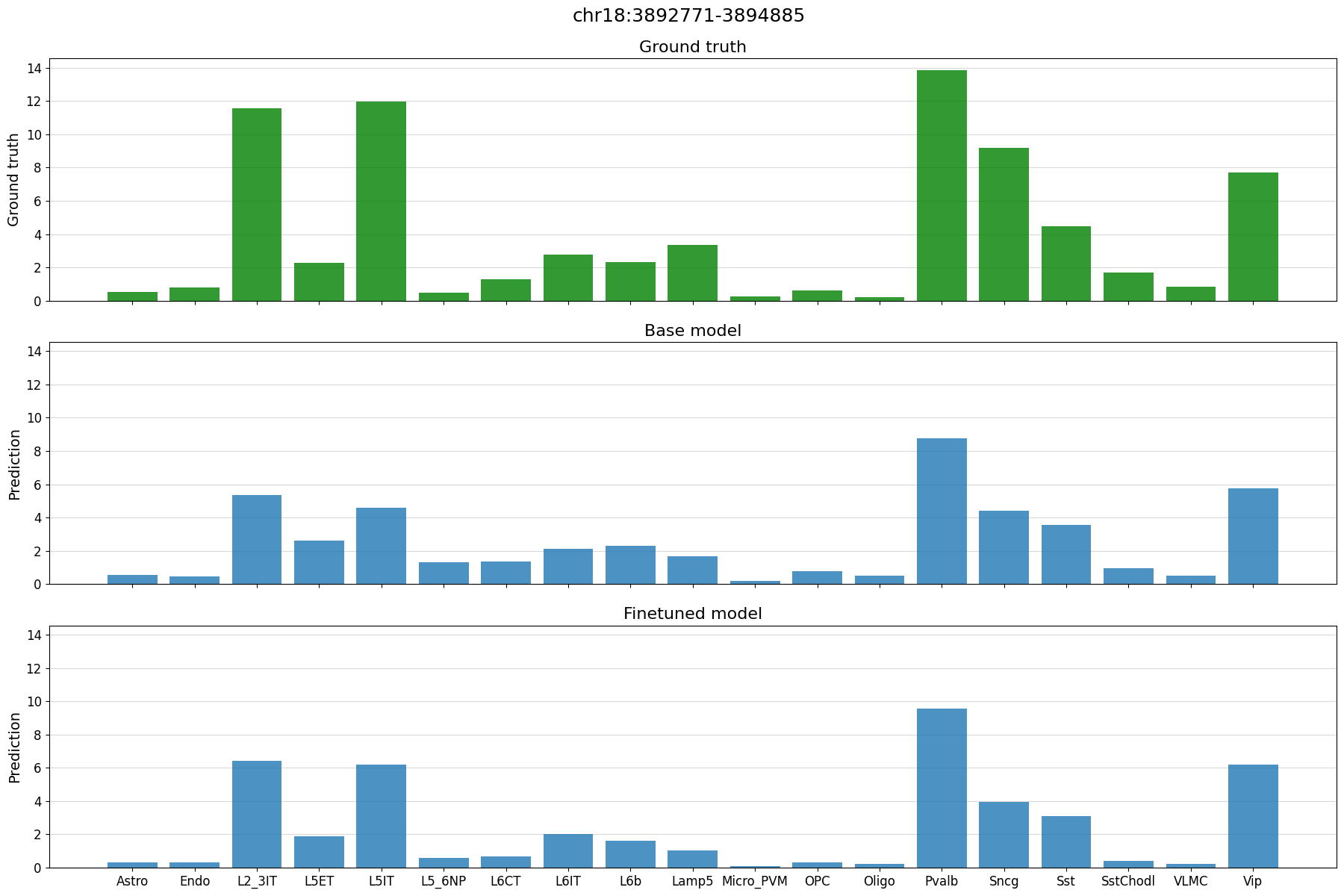
%matplotlib inline
# plot predictions vs ground truth for a random region in the test set defined by index
idx = 21
region = test_df.index[idx]
print(region)
crested.pl.region.bar(adata_specific, region)
chr18:3892771-3894885
2026-02-16T13:11:07.047437+0100 INFO Lazily importing module crested.pl. This could take a second...
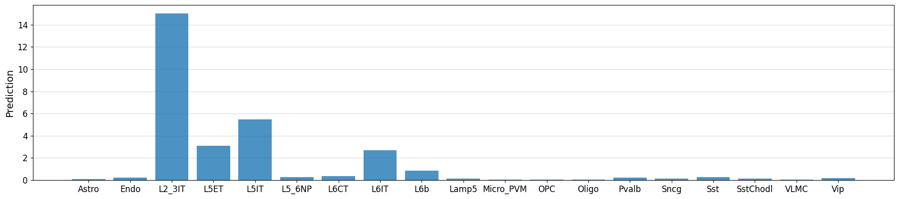
Example predictions on manually defined regions#
# Could also manually fetch and pass sequence with genome.fetch(chrom, start, end)
prediction = crested.tl.predict("chr3:72535071-72537185", model)

crested.pl.region.bar(prediction, classes=list(adata_specific.obs_names))
1/1 ━━━━━━━━━━━━━━━━━━━━ 1s 674ms/step
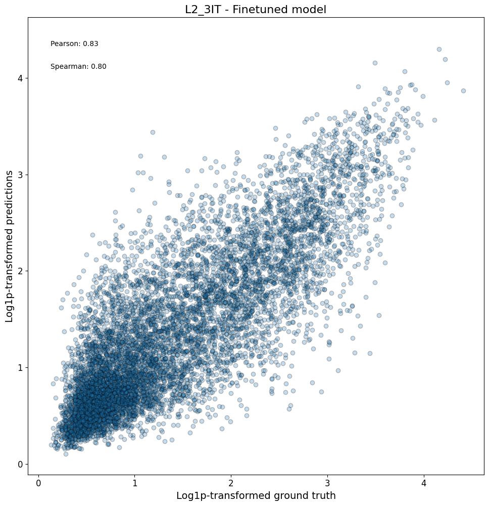
Model performance on the entire test set#
After looking at specific instances, now we can look at the model performance on a larger scale.
First, we can check compare the predictions vs ground truth in a scatterplot for all regions in a class:
crested.pl.corr.scatter(
    adata_specific,
    class_name="L2_3IT",
    model_names="Finetuned model",
    split="test",
    log_transform=True,
    square=True,
    width=10,
    height=10,
)
2026-02-16T13:11:13.759705+0100 INFO Plotting density scatter for class: L2_3IT, models: ['Finetuned model'], split: test
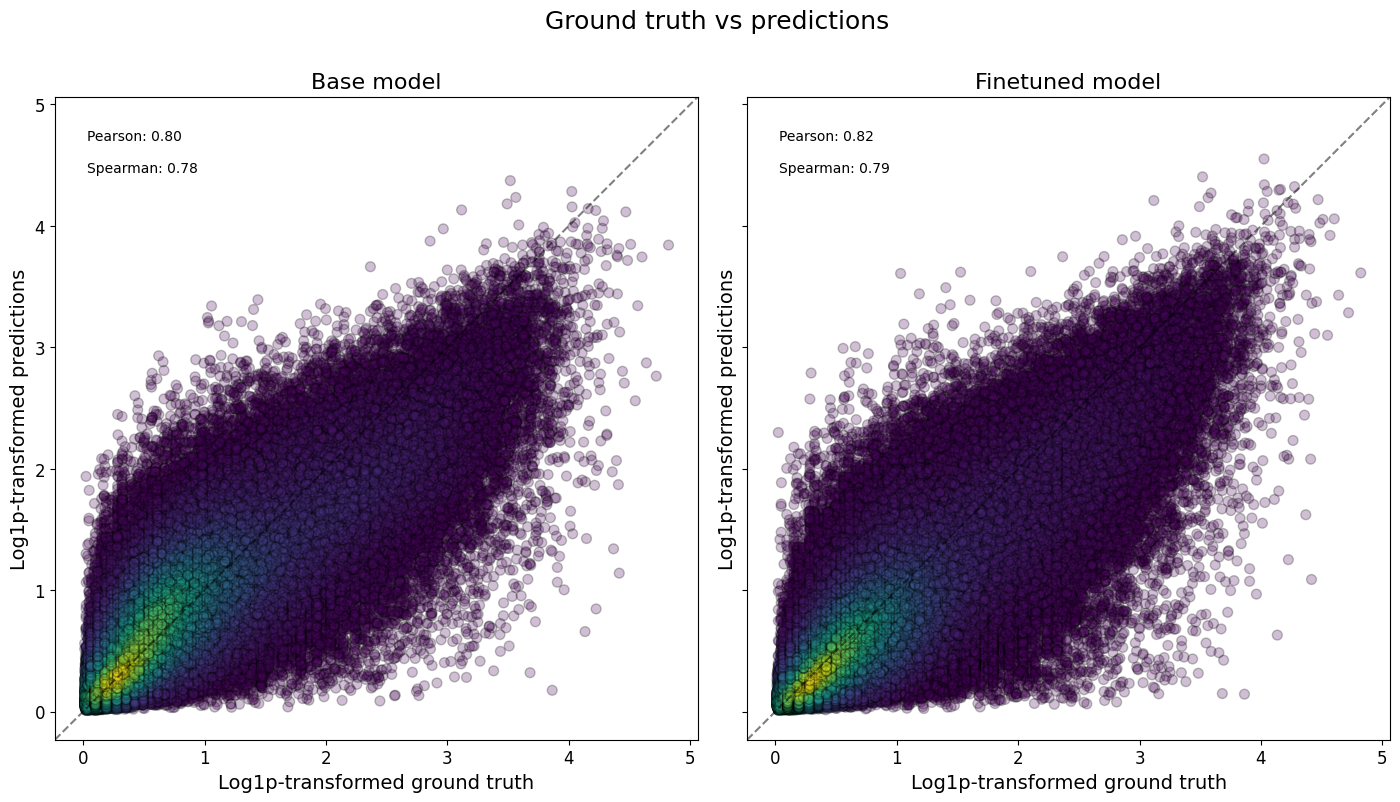
Or even all classes at once, and/or comparing across models:
crested.pl.corr.scatter(
    adata_specific,
    split="test",
    log_transform=True,
    density_indication=True,
    identity_line=True,
    square=True,
)
2026-02-16T13:11:14.081321+0100 INFO Plotting density scatter for all targets and predictions, models: ['Base model', 'Finetuned model'], split: test
To now check the correlations between all classes, we can plot a heatmap to assess the model performance.
crested.pl.corr.heatmap(
    adata_specific,
    split="test",
    log_transform=True,
    vmax=1,
    vmin=0,
)
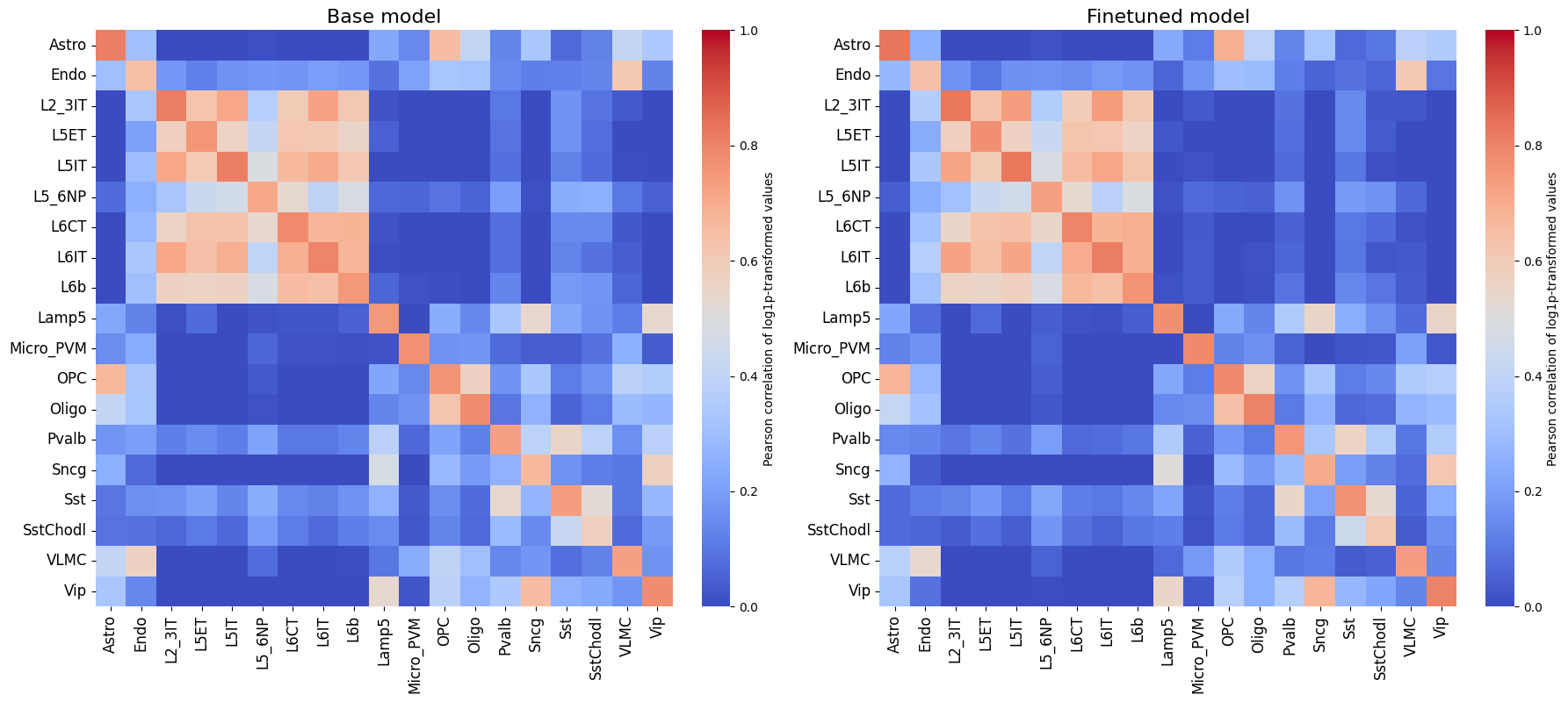
It is also recommended to compare this heatmap to the self-correlation plot of the peaks themselves. If peaks between cell types are correlated, then it is expected that predictions from non-matching classes for correlating cell types will also be high, even if the predictions are perfect.
crested.pl.corr.heatmap_self(
    adata_specific,
    xtick_rotation=90,
    log_transform=True,
    title="Self-correlation heatmap",
    vmax=1,
    vmin=0,
)
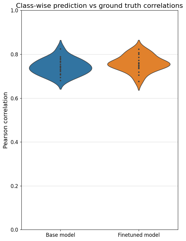
To better compare different models, we can also specifically compare the correlations for each class with their own ground truths (which are shown on the diagonal in the heatmaps). One way is through a violin plot:
%matplotlib inline
crested.pl.corr.violin(adata_specific)
Sequence contribution scores#
We can calculate the contribution scores for a sequence of interest using the contribution_scores() function.
This will give us information on what nucleotides the model is looking at to make its prediction with respect to a specific output class.
You always need to ensure that the sequence or region you provide is the same length as the model input (2114bp in our case).
Here, similar to the predict function, you need some input (like a sequence or region name) and a (list of) model(s). If multiple models are provided, the contribution scores will be averaged.
Contribution scores on manually defined genomic regions#
# similar example but with region names as input
regions_of_interest = "chr18:61107770-61109884"  # FIRE enhancer region (Microglia enhancer)
classes_of_interest = ["Astro", "Micro_PVM"]
class_idx = list(adata_specific.obs_names.get_indexer(classes_of_interest))

scores, one_hot_encoded_sequences = crested.tl.contribution_scores(
    regions_of_interest,
    target_idx=class_idx,
    model=model,
    method="integrated_grad", # recommended. Other options: "expected_integrated_grad" (default), "saliency_map", "mutagenesis", "window_shuffle"
)
2026-02-16T13:11:22.646080+0100 INFO Calculating contribution scores for 2 class(es) and 1 region(s).
Contribution scores for regions can be plotted using the crested.pl.explain.contribution_scores() function.
This will generate a subplot per region, per class.
%matplotlib inline
crested.pl.explain.contribution_scores(
    scores,
    one_hot_encoded_sequences,
    sequence_labels=regions_of_interest,
    class_labels=classes_of_interest,
    zoom_n_bases=500,
    suptitle="FIRE enhancer region",
    suptitle_fontsize=24,
    highlight_positions=(1008, 1014),  # starts counting from start of region, not from zoom
    highlight_kws={'facecolor': 'green', 'edgecolor': 'green', 'alpha': 0.1},
)

Contribution scores on random test set regions#
# plot predictions vs ground truth for a random region in the test set defined by index
idx = 21
region = test_df.index[idx]
classes_of_interest = ["L2_3IT", "Pvalb"]
class_idx = list(adata_specific.obs_names.get_indexer(classes_of_interest))
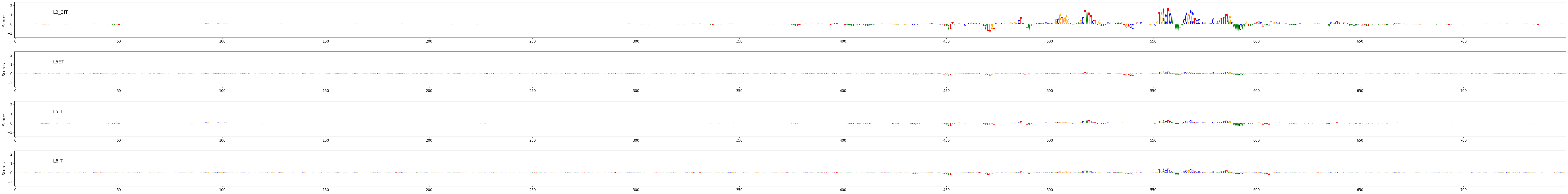
scores, one_hot_encoded_sequences = crested.tl.contribution_scores(
region,
target_idx=class_idx,
model=model,
method='integrated_grad',
)
2026-02-16T13:11:29.056850+0100 INFO Calculating contribution scores for 2 class(es) and 1 region(s).
crested.pl.explain.contribution_scores(
    scores,
    one_hot_encoded_sequences,
    sequence_labels=region,
    class_labels=classes_of_interest,
    zoom_n_bases=500,
    coordinates=region,
    highlight_positions=(3893782, 3893788),
    highlight_kws={'facecolor': 'green', 'edgecolor': 'green', 'alpha': 0.1}
)

Prediction on gene locus#
We can also score a gene locus by using a sliding window over a predefined genomic range. We can then compare those predictions to the bigWig of the cell type where we got our peak scores from, to see if the CREsted predictions match the measured data.
chrom = "chr18"  # Unseen chromosome
start = 59175401
end = 59410446

cell_type = "L6CT"
class_idx = list(adata_specific.obs_names).index(cell_type)

upstream = 50000
downstream = 25000

strand = "+"

scores, coordinates, min_loc, max_loc, tss_position = crested.tl.score_gene_locus(
    chr_name=chrom,
    gene_start=start,
    gene_end=end,
    target_idx=class_idx,
    model=model,
    strand=strand,
    upstream=upstream,
    downstream=downstream,
    step_size=100,
)
25/25 ━━━━━━━━━━━━━━━━━━━━ 2s 86ms/step
bigwig = os.path.join(bigwigs_folder, f"{cell_type}.bw")

values = (
    crested.utils.read_bigwig_region(bigwig, (chrom, start - upstream, end + downstream))
    if strand == "+"
    else crested.utils.read_bigwig_region(bigwig, (chrom, start - downstream, end + upstream))
)
bw_values = values[0]
midpoints = values[1]
Note that here we compared pooled predictions over 1kb regions and cut-sites at 1 bp resolution from a cut-sites BigWig. To get a better comparison between the predicted and scATAC track, we recommend to compare against a coverage BigWig.
%matplotlib inline
crested.pl.locus.locus_scoring(
    scores,
    (min_loc, max_loc),
    gene_start=start,
    gene_end=end,
    suptitle="CREsted prediction around Chsy3 gene for " + cell_type,
    bigwig_values=bw_values,
    bigwig_midpoints=midpoints,
    grid='x',
    width=20,
    height=5,
    locus_plot_kws={'markersize': 2, 'linewidth': 1},
)
Enhancer design#
Enhancer design is an important concept in understanding a cell type’s cis-regulatory code.
By designing sequences to be specifically accessible for a cell type and inspecting those designed sequences’ contribution score plots, we can get an understanding of which motifs are most important for that cell type’s enhancer code. Moreover, by inspecting intermediate results throughout the optimization process, we can see which motifs and which motif positions have a comparatively higher priority.
We follow the enhancer design process as described in this paper (Taskiran et al., Nature, 2024). We start from random sequences and select at each step the nucleotide mutation or motif implementation that will lead to the largest change in specific accessibility for a chosen cell type.
Sequence evolution#
The standard way of designing enhancers (by making single nucleotide mutations in randomly generated regions) can be carried out using in_silico_evolution().
Before we start designing, we will calculate the nucleotide distribution of our consensus regions, which will be used for creating random starting sequences. If you don’t do this, the design function will assume a uniform distribution.
acgt_distribution = crested.utils.calculate_nucleotide_distribution(
    adata_specific,  # accepts any sequence input, same as before
    per_position=True,  # return a distirbution per position in the sequence
)
acgt_distribution.shape
(2114, 4)
# we will design an enhancer for the L5ET cell type
class_idx = list(adata_specific.obs_names).index("L5ET")

intermediate_results, designed_sequences = crested.tl.design.in_silico_evolution(
    model=model,
    target=class_idx,  # the default optimization function expects a target class index
    n_mutations=10,    # n single nucleotide mutations to make per sequence
    n_sequences=2,     # n enhancers to design
    target_len=500,    # only make mutations in the center 500bp
    acgt_distribution=acgt_distribution,  # if None, uniform distribution will be used
    return_intermediate=True, # allows inspection of improvements at every step
)
%matplotlib inline
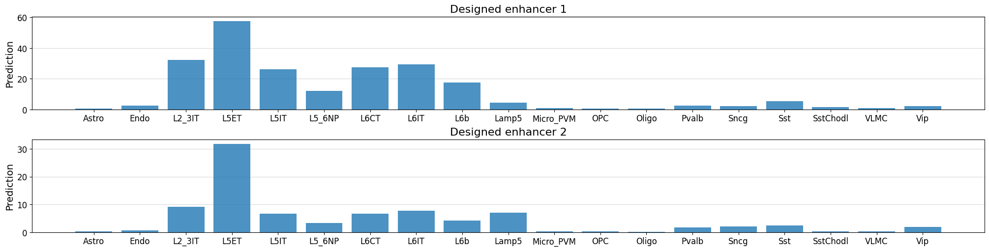
# Check predictions for the designed sequences - ensure that they're high for our target class
fig, axs = plt.subplots(2, figsize = (20, 5), layout='constrained')
for i in range(len(designed_sequences)):
prediction = crested.tl.predict(designed_sequences[i], model=model)
crested.pl.region.bar(prediction, classes=list(adata_specific.obs_names), title=f"Designed enhancer {i+1}", ax=axs[i], show=False)
1/1 ━━━━━━━━━━━━━━━━━━━━ 0s 20ms/step
1/1 ━━━━━━━━━━━━━━━━━━━━ 0s 19ms/step
# Calculate contribution scores for the designed sequences
scores, one_hot_encoded_sequences = crested.tl.contribution_scores(
    designed_sequences,
    model=model,
    target_idx=class_idx,
)
2026-02-16T13:11:55.718144+0100 INFO Calculating contribution scores for 1 class(es) and 2 region(s).
crested.pl.explain.contribution_scores(
    scores,
    one_hot_encoded_sequences,
    sequence_labels=["Synthetic L5ET enhancer 1", "Synthetic L5ET enhancer 2"],
    title_fontsize=20,
    class_labels="L5ET",
    zoom_n_bases=750,
)

Keep in mind that, if you start from random sequences, enhancer design will be non-deterministic so you won’t get the exact same results twice.
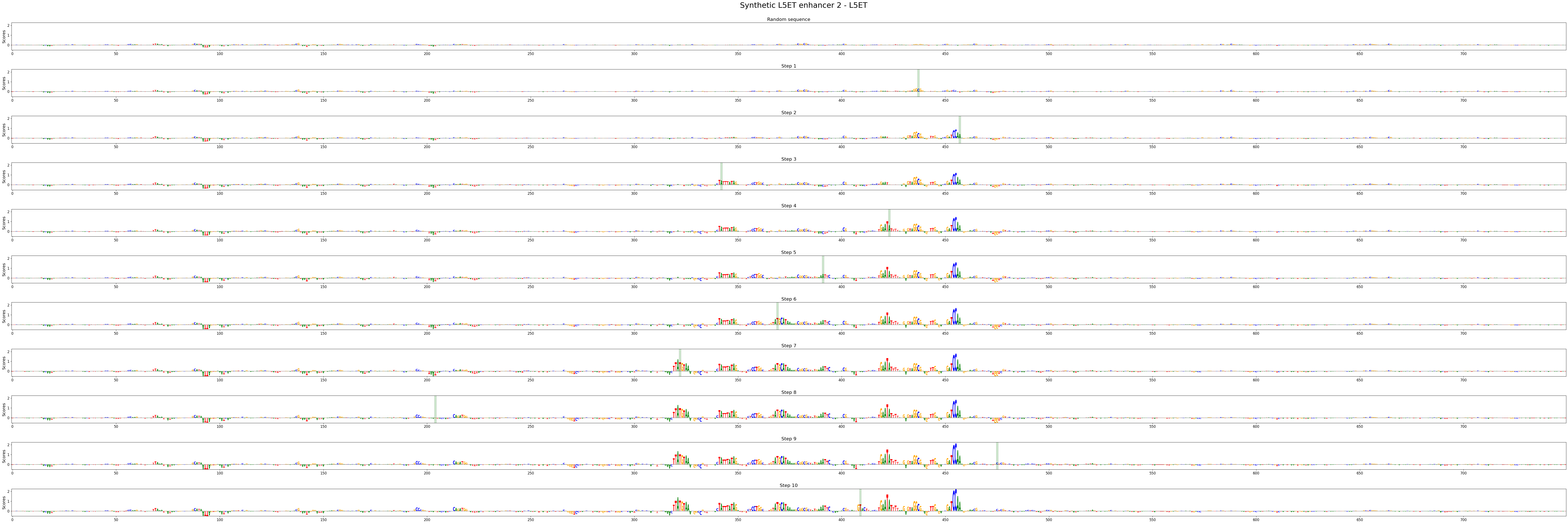
Inspecting the enhancer design process#
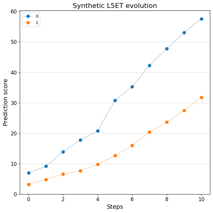
Thanks to the handy return_intermediate parameter, we can inspect at which point in the process which mutations are made. We can use some specialized plotting functions to visualize this process. Let’s first look at the predictions:
print(intermediate_results[0].keys())
dict_keys(['initial_sequence', 'changes', 'predictions', 'designed_sequence'])
# Plot the change of predictions along the design process
%matplotlib inline
crested.pl.design.step_predictions(
    intermediate_results,
    target_classes="L5ET",
    obs_names=adata_specific.obs_names,
    separate=True,
    legend_separate=True,
    title="Synthetic L5ET evolution",
    width=7,
    height=7,
)
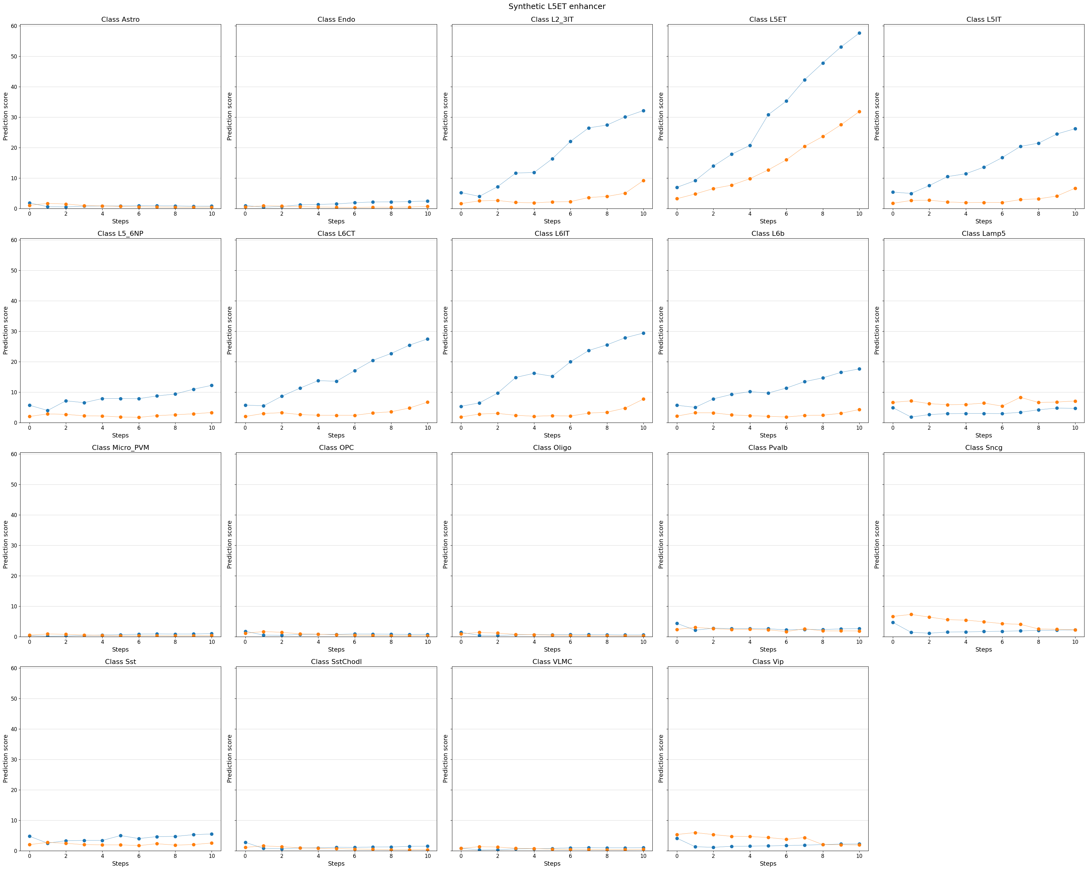
# You can even visualize other (off-target) classes, or all classes
%matplotlib inline
crested.pl.design.step_predictions(
    intermediate_results,
    target_classes=adata_specific.obs_names,
    obs_names=adata_specific.obs_names,
    separate=True,
    suptitle="Synthetic L5ET enhancer",
)
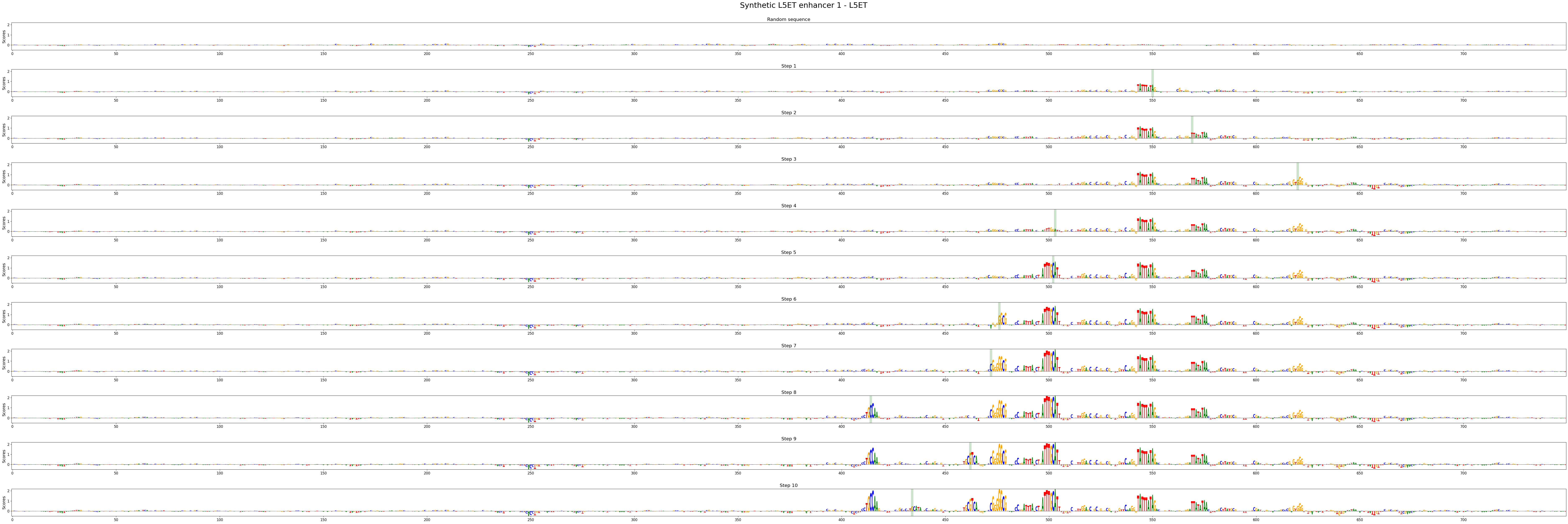
We can also look at the contribution scores for every step in the evolution:
# There's a utility function to extract the intermediate sequences from the dict
intermed_seqs = crested.tl.design.derive_intermediate_sequences(intermediate_results)

# With which we can calculate contribution scores as usual:
scores_all = []
seqs_one_hot_all = []
for seq_idx in range(len(intermed_seqs)):
    scores, one_hot_encoded_sequences = crested.tl.contribution_scores(
        intermed_seqs[seq_idx],
        target_idx=class_idx,
        model=model,
    )
    scores_all.append(scores)
    seqs_one_hot_all.append(one_hot_encoded_sequences)
2026-02-16T13:12:08.395529+0100 INFO Calculating contribution scores for 1 class(es) and 11 region(s).
2026-02-16T13:12:18.724980+0100 INFO Calculating contribution scores for 1 class(es) and 11 region(s).
crested.pl.design.step_contribution_scores() shows the change locations, and supports multiple designed sequences.
You can also use standard plotting to visualize the scores, of course.
crested.pl.design.step_contribution_scores(
    intermediate_results,
    scores_all=scores_all,
    seqs_one_hot_all=seqs_one_hot_all,
    zoom_n_bases=750,
    sequence_labels=["Synthetic L5ET enhancer 1", "Synthetic L5ET enhancer 2"],
    class_labels="L5ET",
    highlight_kws={"facecolor": "green", "edgecolor": "black", "alpha": 0.2}
)
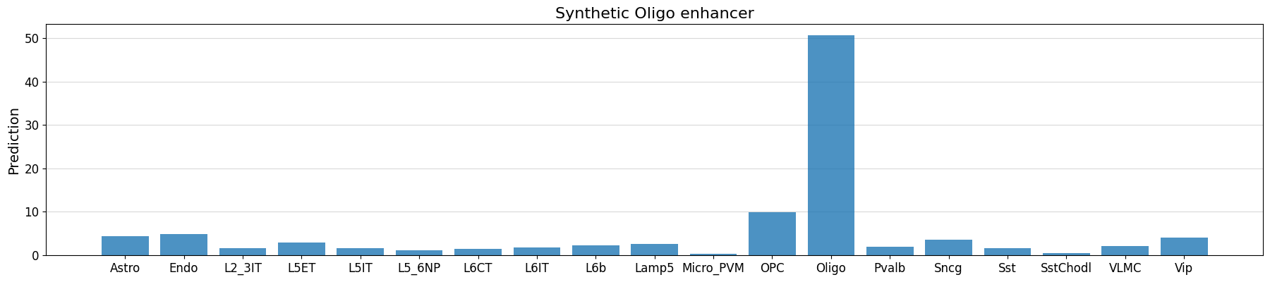
Motif insertion#
Another way of designing enhancers is by embedding known motifs into our sequences.
This way, you can investigate how specific motif combinations influence a sequence’s accessibility profile.
For this, you can use the crested.tl.design.motif_insertion() function. We can use the intermediate results to highlight the inserted motifs.
class_idx = list(adata_specific.obs_names).index("Oligo")

intermediate_results, designed_sequences = crested.tl.design.motif_insertion(
    patterns={
        "SOX10": "AACAATGGCCCCATTGT",
        "CREB5": "ATGACATCA",
    },
    target=class_idx,
    model=model,
    acgt_distribution=acgt_distribution,
    n_sequences=2,
    target_len=500,
    return_intermediate=True,
)
seq_idx = 0

# check whether our implanted motifs have the expected effect
prediction = crested.tl.predict(designed_sequences, model=model)
crested.pl.region.bar(
    prediction[seq_idx],
    classes=list(adata_specific.obs_names),
    title="Synthetic Oligo enhancer",
)
1/1 ━━━━━━━━━━━━━━━━━━━━ 1s 644ms/step
intermediate_results[0]["changes"]
[(-1, 'N'), (1017, 'AACAATGGCCCCATTGT'), (998, 'ATGACATCA')]
scores, one_hot_encoded_sequences = crested.tl.contribution_scores(
    designed_sequences[seq_idx],
    target_idx=class_idx,
    model=model,
)
motif_positions = []
for motif in intermediate_results[seq_idx]["changes"]:
    motif_start = motif[0]
    motif_end = motif_start + len(motif[1])
    if motif_start != -1:
        motif_positions.append((motif_start, motif_end))
2026-02-16T13:13:38.394590+0100 INFO Calculating contribution scores for 1 class(es) and 1 region(s).
# see whether the model is actually using the implanted motifs
crested.pl.explain.contribution_scores(
    scores,
    one_hot_encoded_sequences,
    sequence_labels="",
    class_labels=["Oligo"],
    zoom_n_bases=500,
    title="synth Oligo",
    height=3,
    highlight_positions=motif_positions,
)

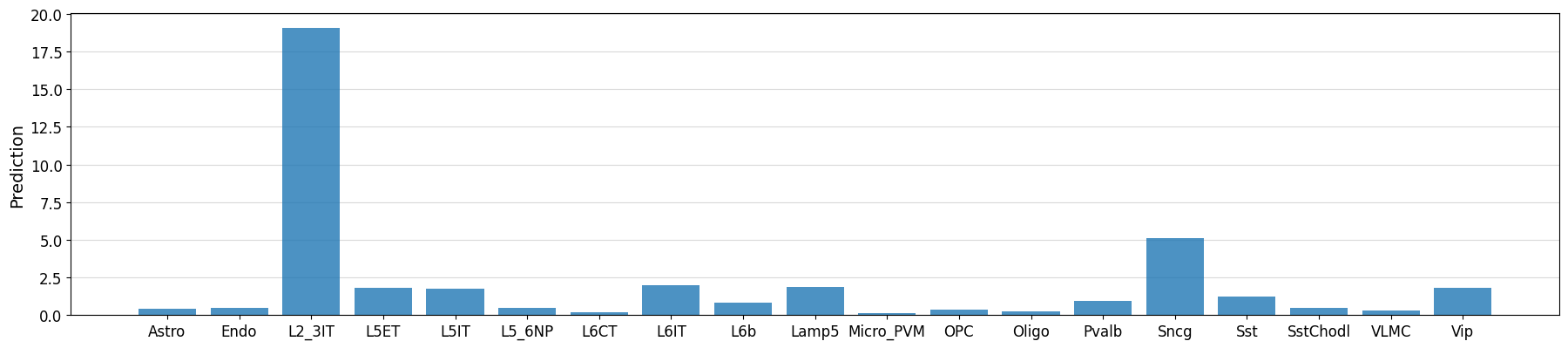
Using custom optimizers in enhancer design#
The default optimization function that is used in enhancer design is a weighted difference function that maximizes the increase in accessibility for a target cell type while penalizing an increase in accessibility for other cell types.
This is just one option though, many use cases exist where you might want to optimize for something different. For example, you could write an optimization function that maximizes the cosine similarity between a given accessibility vector and the designed sequence predicted accessibility vector.
Below we give an example on how to write such a custom optimization function, wherein we will try to reach a specific accessibility value for some target cell type relative to other related cell types using the L2 distance.
By default, the EnhancerOptimizer expects an optimization function as input that has the arguments mutated_predictions, original_predictions, and target, and returns the index of the best mutated sequence. See its documentation for more information.
from sklearn.metrics import pairwise


def L2_distance(
    mutated_predictions: np.ndarray,
    original_prediction: np.ndarray,
    target: np.ndarray,
    classes_of_interest: list[int],
):
    """Calculate the L2 distance between the mutated predictions and the target class"""
    if len(original_prediction.shape) == 1:
        original_prediction = original_prediction[None]
    L2_sat_mut = pairwise.euclidean_distances(
        mutated_predictions[:, classes_of_interest],
        target[classes_of_interest].reshape(1, -1),
    )
    L2_baseline = pairwise.euclidean_distances(
        original_prediction[:, classes_of_interest],
        target[classes_of_interest].reshape(1, -1),
    )
    return np.argmax((L2_baseline - L2_sat_mut).squeeze())


L2_optimizer = crested.tl.design.EnhancerOptimizer(optimize_func=L2_distance)

target_cell_type = "L2_3IT"

classes_of_interest = [i for i, ct in enumerate(adata_specific.obs_names) if ct in ["L2_3IT", "L5ET", "L5IT", "L6IT"]]
target = np.array([20 if x == target_cell_type else 0 for x in adata_specific.obs_names])
intermediate, designed_sequences = crested.tl.design.in_silico_evolution(
    model=model,
    target=target,  # our optimization function now expects a target vector instead of a class index
    n_sequences=1,
    n_mutations=30,
    enhancer_optimizer=L2_optimizer,
    return_intermediate=True,
    no_mutation_flanks=(807, 807),
    acgt_distribution=acgt_distribution,
    classes_of_interest=classes_of_interest,  # additional kwargs will be passed to the optimizer
)
idx = 0
prediction = crested.tl.predict(designed_sequences[idx], model=model)
crested.pl.region.bar(prediction, classes=list(adata.obs_names))
1/1 ━━━━━━━━━━━━━━━━━━━━ 0s 20ms/step
class_idx = list(adata_specific.obs_names.get_indexer(["L2_3IT", "L5ET", "L5IT", "L6IT"]))

scores, one_hot_encoded_sequences = crested.tl.contribution_scores(
    designed_sequences[idx],
    target_idx=class_idx,
    model=model,
)
2026-02-16T13:13:57.133249+0100 INFO Calculating contribution scores for 4 class(es) and 1 region(s).
crested.pl.explain.contribution_scores(
    scores,
    one_hot_encoded_sequences,
    sequence_labels="",
    class_labels=["L2_3IT", "L5ET", "L5IT", "L6IT"],
    zoom_n_bases=750,
)