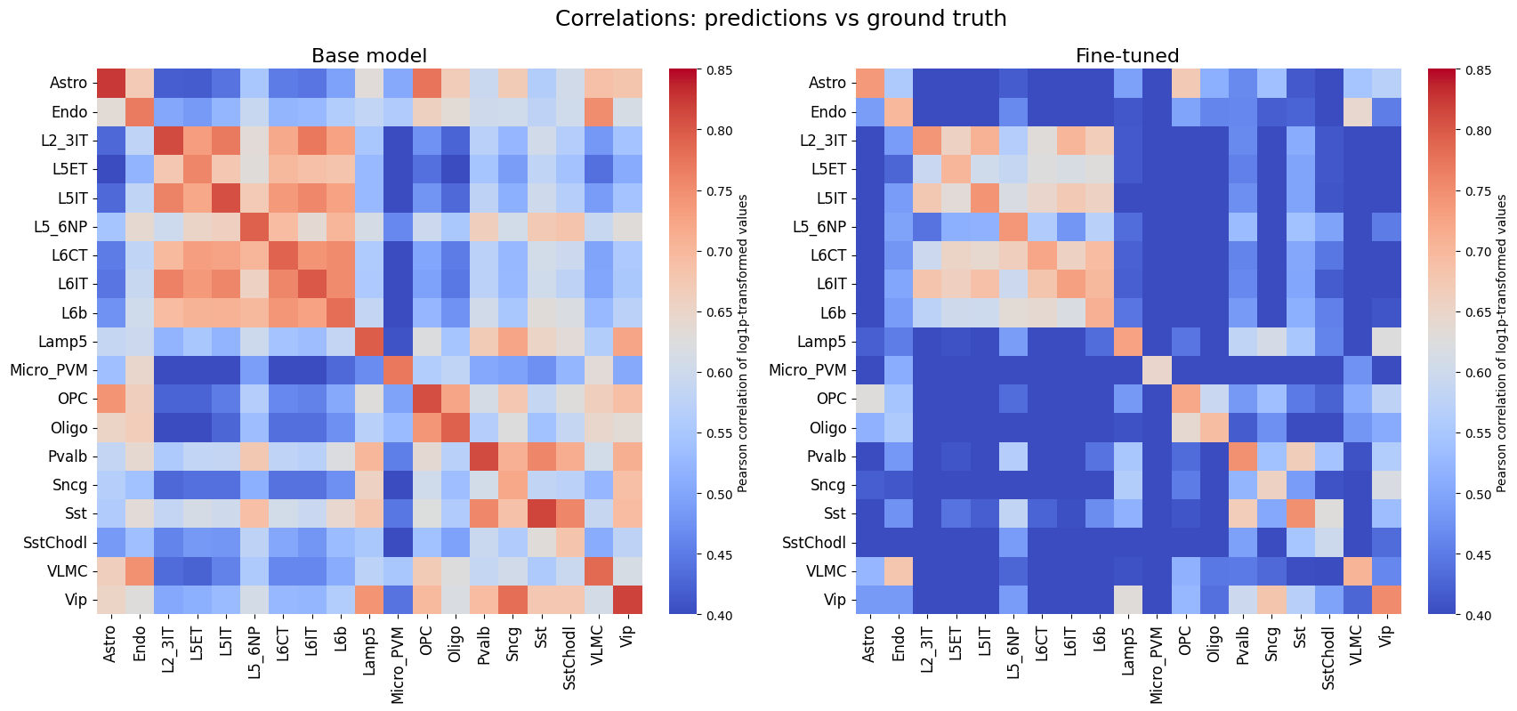
crested.pl.corr.heatmap#
- crested.pl.corr.heatmap(adata, model_names=None, split='test', log_transform=False, vmin=None, vmax=None, reorder=False, cmap='coolwarm', cbar=True, cbar_kws=None, plot_kws=None, ax=None, **kwargs)#
Plot correlation heatmaps of predictions vs ground truth for all cell types.
- Parameters:
adata (
AnnData) – AnnData object containing the data inXand predictions inlayers.model_names (
str|list[str] |None(default:None)) – Model name or list of model names (adata.layers) to plot for predictions heatmap. Default is to plot all models inadata.layers.split (
str|None(default:'test')) – ‘train’, ‘val’, ‘test’ subset or None. If None, will use all targets. If not None, expects a “split” column in adata.var.log_transform (
bool(default:False)) – Whether to log-transform the data before plotting.vmin (
float|None(default:None)) – Minimum value for heatmap color scale.vmax (
float|None(default:None)) – Maximum value for heatmap color scale.reorder (
bool(default:False)) – Whether or not to order the clases by similarity (boolean).cmap (
str|Colormap(default:'coolwarm')) – Colormap to use.cbar (
bool(default:True)) – whether to draw a colorbar.cbar_kws (
dict|None(default:None)) – Extra keyword arguments passed to the colorbar. Default is{'label': "Pearson correlations (of log1p-transformed values)"}plot_kws (
dict|None(default:None)) – Extra keyword arguments passed toheatmap(). Adjusted defaults compared to the base function aresquare=Trueandfmt='.2f'.ax (
Axes|None(default:None)) – Axis to plot values on. If not supplied, creates a figure from scratch. Can only be supplied if plotting a single model.width – Width of the newly created figure if
ax=None. Default is 10 per model to plot, or 8 ifcbar=False.height – Height of the newly created figure if
ax=None. Default is 8 per model to plot.kwargs – Additional arguments passed to
render_plot()to control the final plot output. Please seerender_plot()for details. Custom defaults forcorrelations_predictions:xtick_rotation=90,layout='compressed',title=list(adata.obs_names).
- Return type:
Examples
>>> crested.pl.corr.heatmap(
...     adata,
...     model_names=None,
...     split="test",
...     log_transform=True,
...     vmin=0.4,
...     vmax=0.85,
...     suptitle="Correlations: predictions vs ground truth",
... )